We Post You Profit.
A messaging and landing page iteration for Voucher Connect's postal gift card fulfilment service, moving the pitch from a features list to a straight case for why doing it yourself costs a restaurant more than it looks like.
The Brief.
Voucher Connect offers restaurants a way to hand off the printing and postage of physical gift cards entirely, rather than managing that process in house. The landing page for this service had seven core points it needed to land, regardless of how the copy and layout evolved around them:
The core insight driving this round of revisions was a loss framed one: restaurants fulfilling gift cards themselves usually don't realise how much time and money that process is actually costing them. Rather than pitching the service purely on what it adds, the copy needed to make that hidden cost visible first.
Progress Drafts.
The page went through several rounds as the headline, why choose us section and iconography were reworked in place:
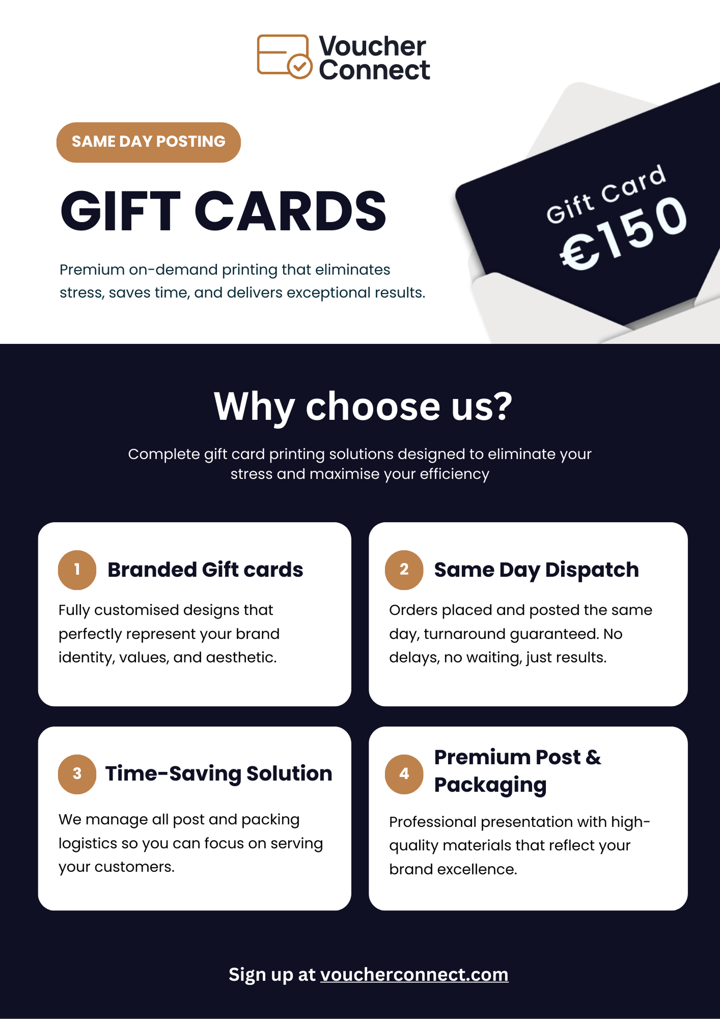
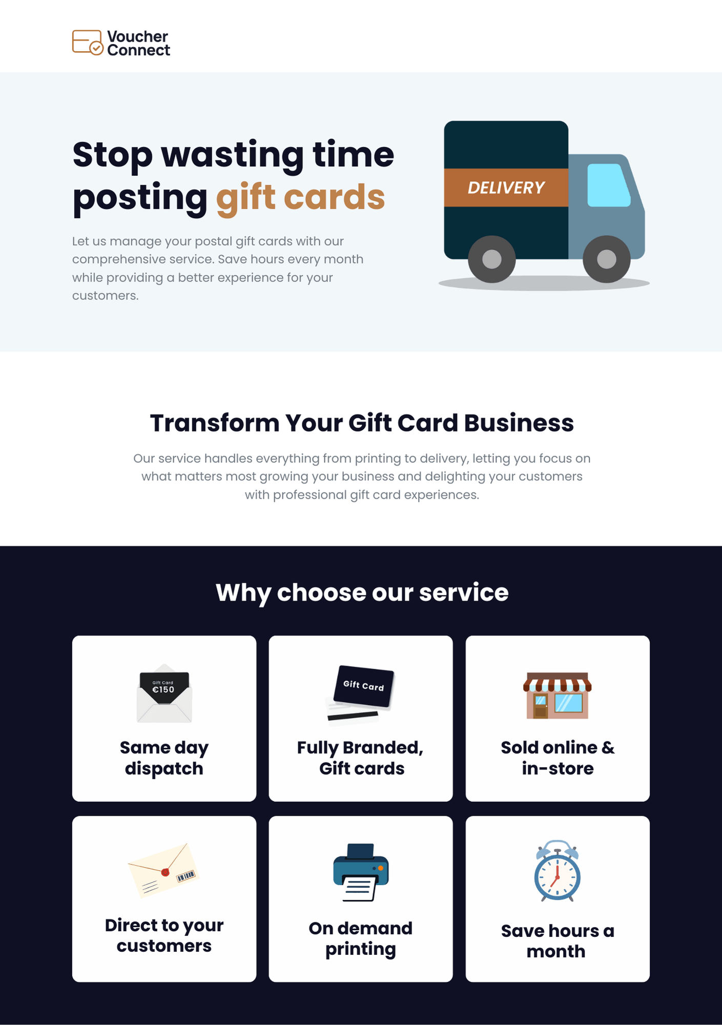
Headline & Positioning.
The headline and subheadline were rewritten to lead with the outcome rather than the mechanism:
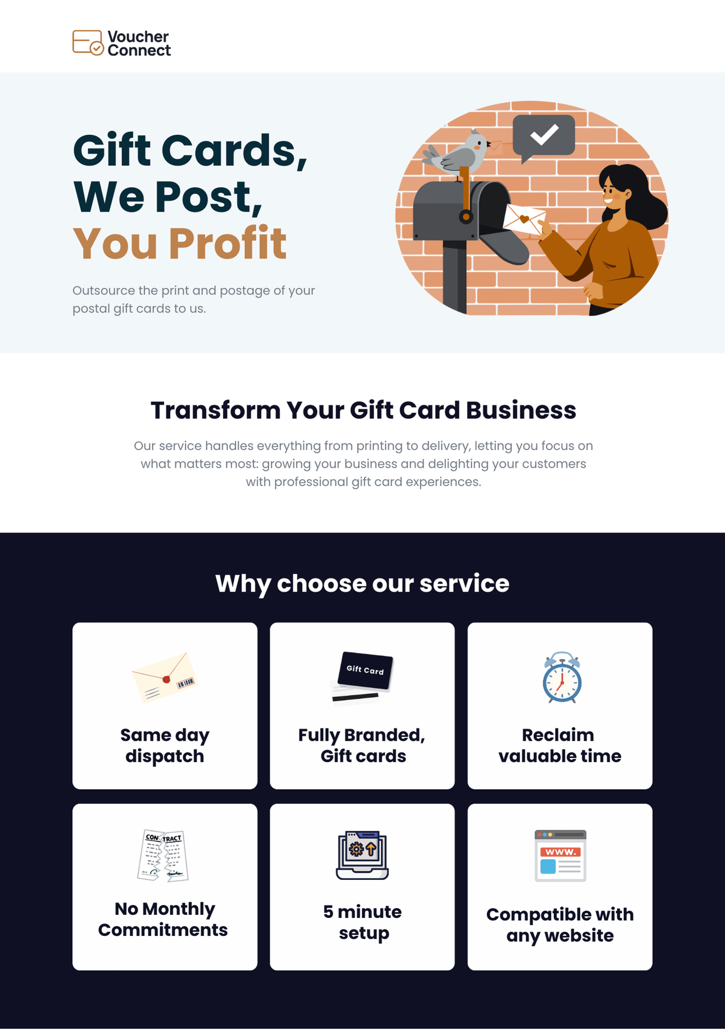
Headline
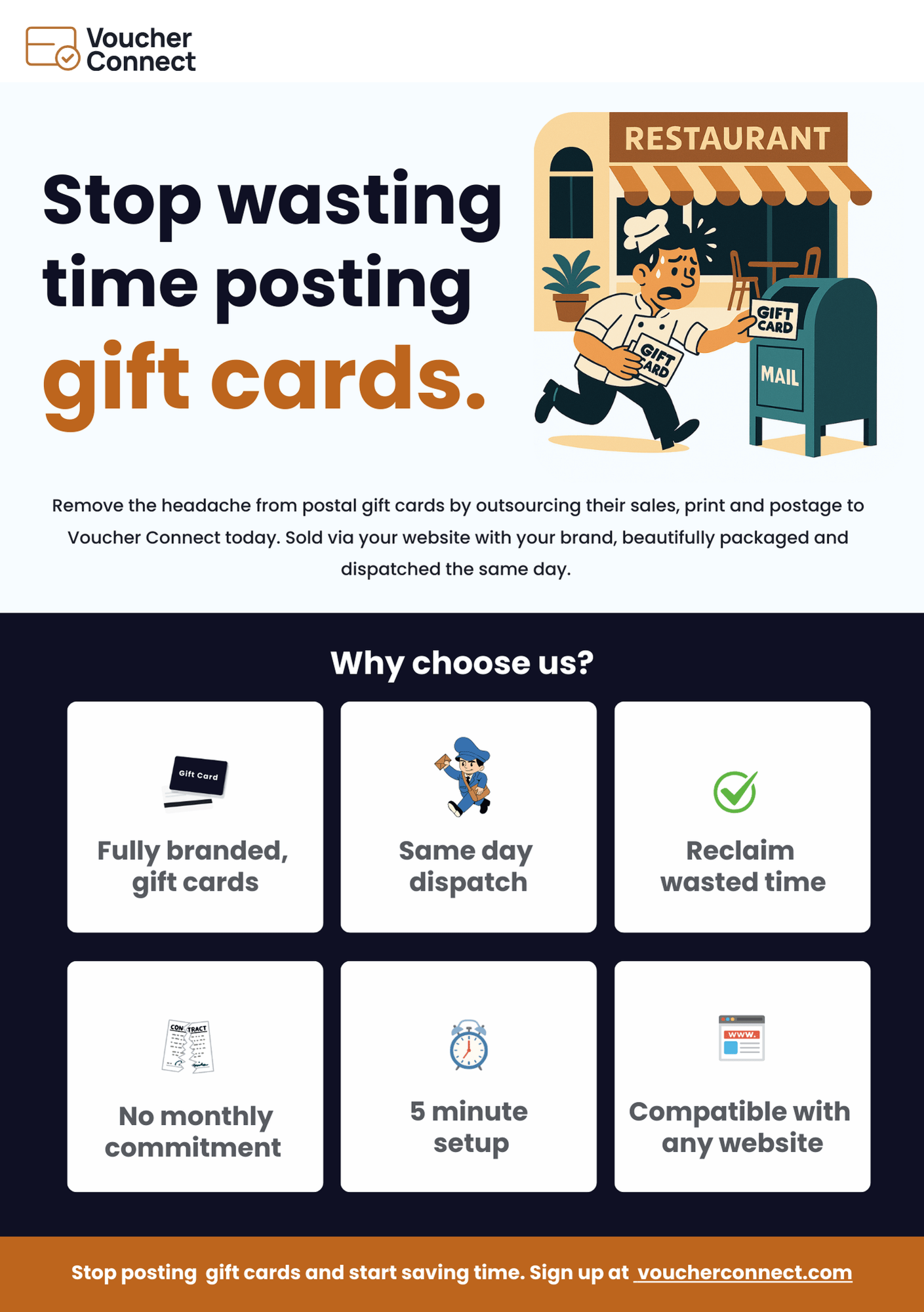
Gift Cards, We Post, You Profit. The split structure puts the restaurant's outcome, profit, directly next to the action they're being asked to hand off, posting, rather than burying the benefit in a longer sentence.
Subheadline
Outsource the print and postage of your postal gift cards to us. A direct, literal restatement of the offer, giving the headline's promise something concrete to stand on immediately below it.
Why Choose Us.
The section formerly labelled why chose our service was corrected to why choose us and rebuilt around objections a restaurant owner would actually raise, rather than generic capability statements:
| Was | Now | Why |
|---|---|---|
| On Demand Printing | 5 Minute Setup | Speed to get started matters more at decision time than a capability that's assumed anyway. |
| Direct to Your Customers | No Monthly Commitment | Removes the pricing objection that would otherwise stop a restaurant from trying the service at all. |
| Sold Online & In-Store | Reclaim Valuable Time | Reframes the same point around what the restaurant gets back, paired with a negative image to reinforce what's currently being lost. |
| Save Hours a Month | Compatible with Any Website | Swaps a vague time saving claim for a concrete technical answer to whether the service will actually work with their existing setup. |
Fully branded gift cards were also promoted to the first point in the list. For a restaurant, a gift card that doesn't look and feel like their own brand is close to worthless, so leading with brand fidelity rather than burying it further down the page puts the strongest differentiator first.
Visual & Iconography.
Several visual changes were made alongside the copy, aimed at making the offer feel concrete rather than abstract:
- More illustrative iconography: The original icon read as too simple for the problem being solved. It's being reworked into a small illustrated scene, a person and a mailbox, so the icon itself communicates the fulfilment process at a glance rather than relying on a generic symbol.
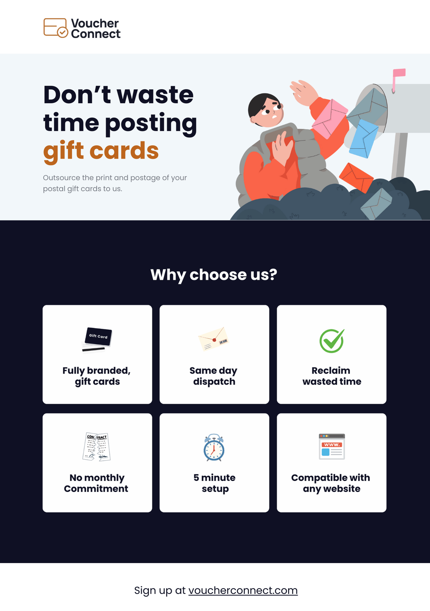
- Reclaim Valuable Time as a negative image: Rather than illustrating the benefit positively, this section pairs the copy with a negative image, wasted time, a clock set to five minutes, to reinforce the loss a restaurant is currently absorbing rather than the abstract idea of time saved.
- Larger logo: The Voucher Connect logo at the top of the page was increased in size, giving the brand more presence before the visitor even reaches the headline.
- Sign up bar: A closing bar added at the bottom of the page with a direct call to action, sign up at voucherconnect.com, giving the page an unambiguous final step rather than ending on the feature list.
Final Design.
The finished landing page, carrying the rewritten headline, reordered why choose us section, reworked iconography and the closing sign up bar through to a single, cohesive page:
Results & Outcomes.
This revision pass gives the landing page a clearer argument, built around loss and relief rather than a plain list of capabilities:
| Deliverable | Outcome |
|---|---|
| Headline | Rewritten to Gift Cards, We Post, You Profit |
| Subheadline | Rewritten to state the offer directly |
| Why choose us | Four points swapped to answer real objections instead of restating capability |
| Feature order | Fully branded gift cards promoted to the first position |
| Iconography | Icon set reworked to illustrate the actual fulfilment problem |
| Time messaging | Reclaim Valuable Time paired with a negative image and five minute clock |
| Branding | Logo enlarged, section heading typo corrected |
| Conversion | Sign up bar added at the foot of the page |
Key Observations.
Losses Motivate More Than Features
A restaurant that already fulfils its own gift cards doesn't feel like it has a problem, until it's shown what that process is actually costing in time, packaging quality and stress during busy periods. Leading with that hidden cost, rather than a features list, is what gives Gift Cards, We Post, You Profit its actual argument.
Every Feature Should Answer an Objection
No Monthly Commitment and Compatible with Any Website aren't new capabilities, they're direct answers to the two questions a restaurant owner is most likely to be silently asking: will this lock me in, and will this actually work with what I already have. Reframing existing features around real objections does more work than adding new ones.
An Icon Has to Explain Itself
A generic icon asks the visitor to already understand the service before it makes sense. Moving to a small illustrated scene, a person, a mailbox, gives the icon enough narrative to communicate the fulfilment process on its own, which matters more the less time a visitor is willing to spend reading.