Voucher Connect× Mews
A front-desk interface for redeeming third-party gift vouchers directly against live reservations inside Mews, the hospitality property management platform. The brief: let reception staff validate a guest's voucher code, match it to the correct booking, and apply its balance to the invoice — without leaving the reservation workflow or reconciling anything by hand.
The Brief.
Mews is a cloud property management system used by hotels to run reservations, check-ins, and billing from a single dashboard. Voucher Connect needed an interface that plugs a third-party gift voucher scheme into that workflow: a front-desk agent takes a guest's voucher code, confirms it's valid, finds the reservation it applies to, and applies the remaining balance to that guest's stay — all inside the same screen flow staff already use for check-in.
As the UI/UX designer on the integration, my job was to design every screen in that redemption path in Figma — voucher lookup, guest and reservation search, and the payment/invoice step — while keeping the visual language consistent with the existing Mews-adjacent admin tooling so the new feature felt native rather than bolted on.
Redemption Flow.
The core interaction is a single, linear path with one job at each step — validate the code, find the guest, apply the balance:
Each step was designed as its own screen with a single primary action — Validate, then Next, then a filtered reservation card, then redeem — so a front-desk agent is never more than one decision away from finishing the redemption while a guest is standing at the desk. An invalid or expired code branches into a dedicated error screen rather than a dead end, so staff always know exactly why a voucher didn't clear.
Screen & Interface Design.
Each stage of the flow got its own dedicated screen, built around the specific decision the agent needs to make at that point:
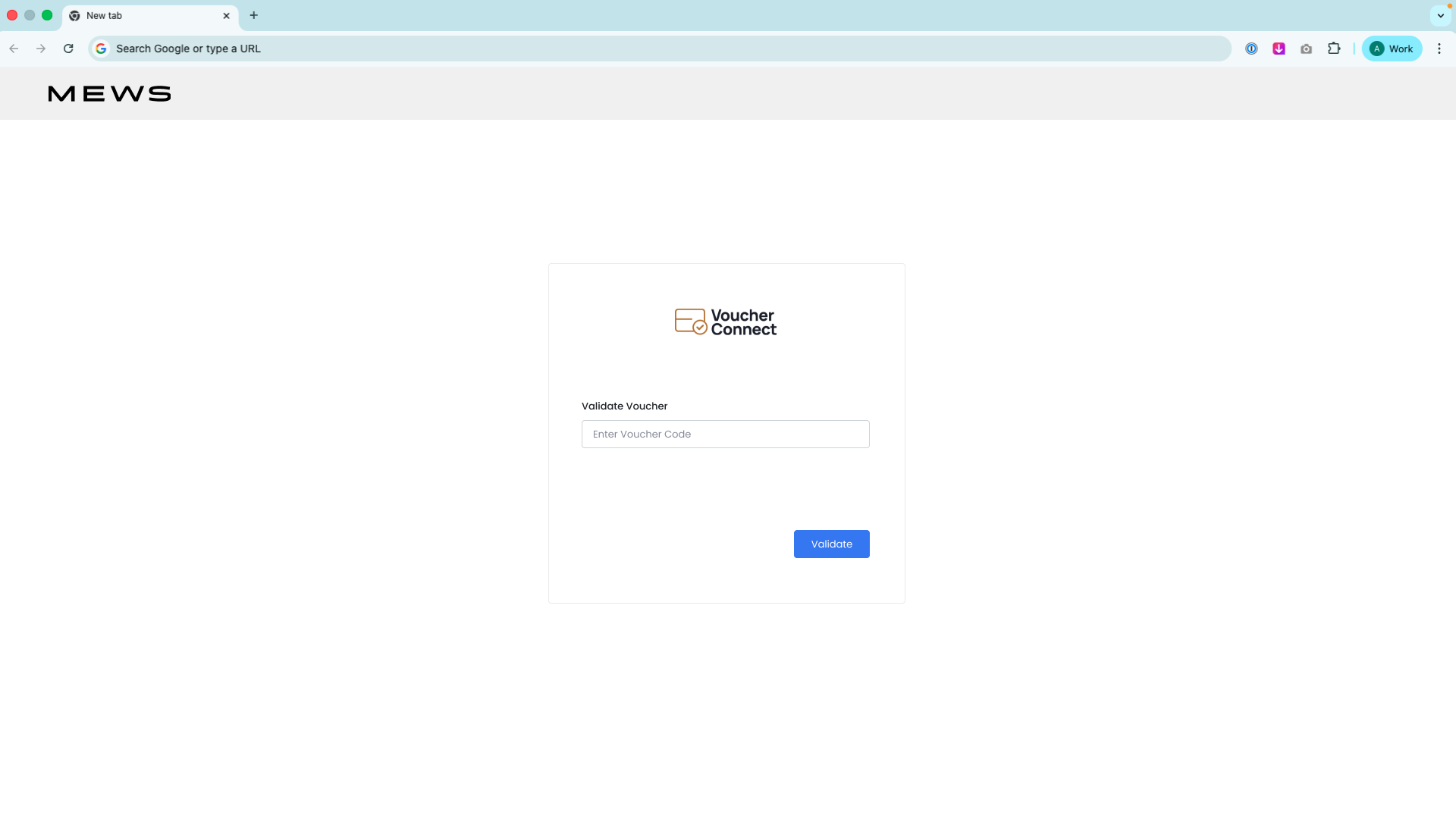
Voucher Validation
A single-field entry screen — "Enter Voucher Code" — with one primary action, Validate, so the very first step of redemption asks for nothing but the code itself.
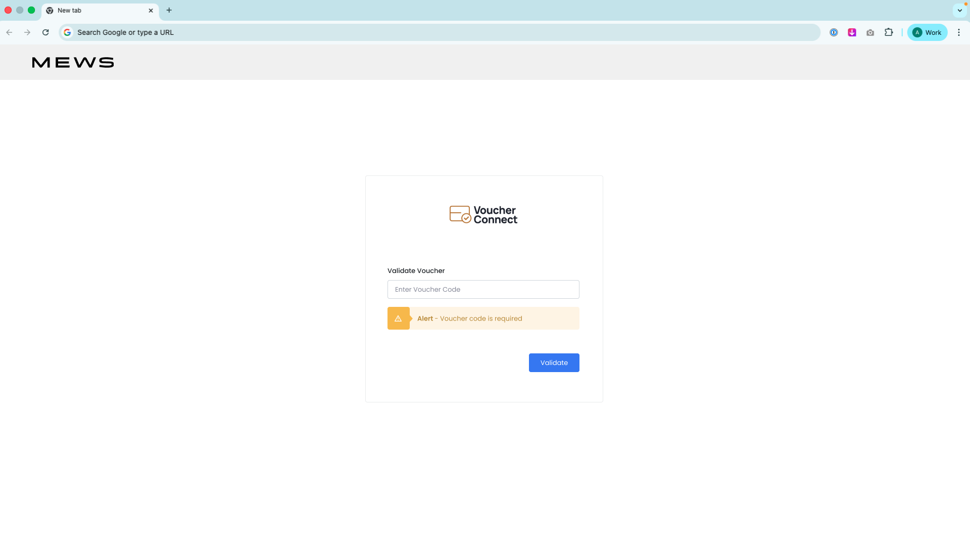
Error Handling
An invalid, expired, or already-redeemed code surfaces a clear inline error rather than a generic failure — so staff can explain to the guest exactly what went wrong instead of guessing.
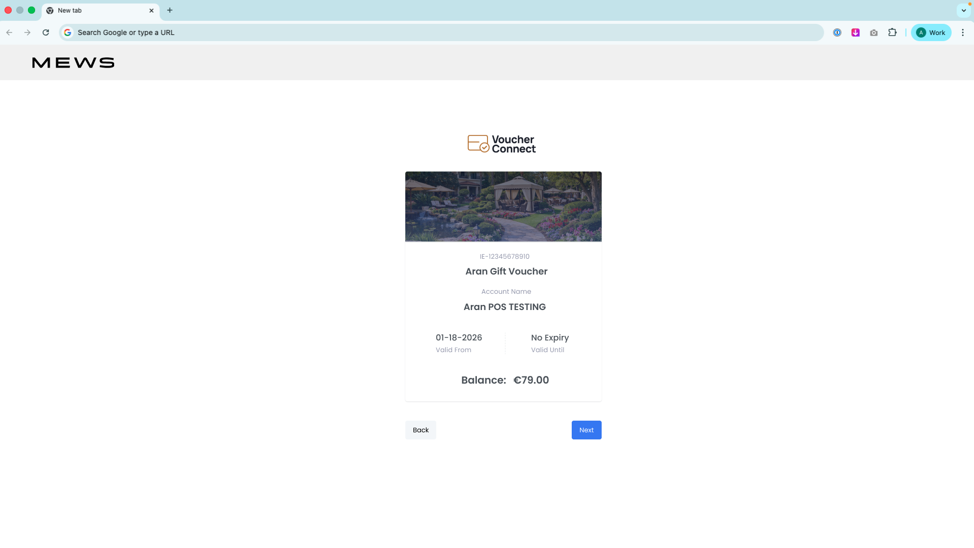
Voucher Detail Card
On successful validation, a card surfaces the voucher name, issuing store, voucher ID, valid-from date, expiry status (including "No Expiry" vouchers), and remaining balance — everything an agent needs to confirm before proceeding.
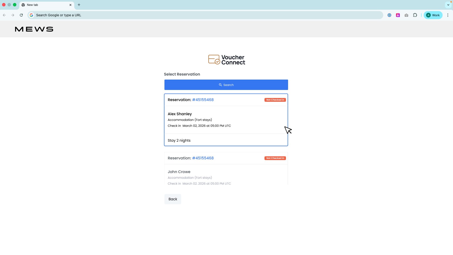
Reservation Search
A "Select Reservation" screen with a live search bar and a card-based list of matching bookings — each card showing reservation number, guest name, accommodation type, check-in date and time, length of stay, and check-in status at a glance.
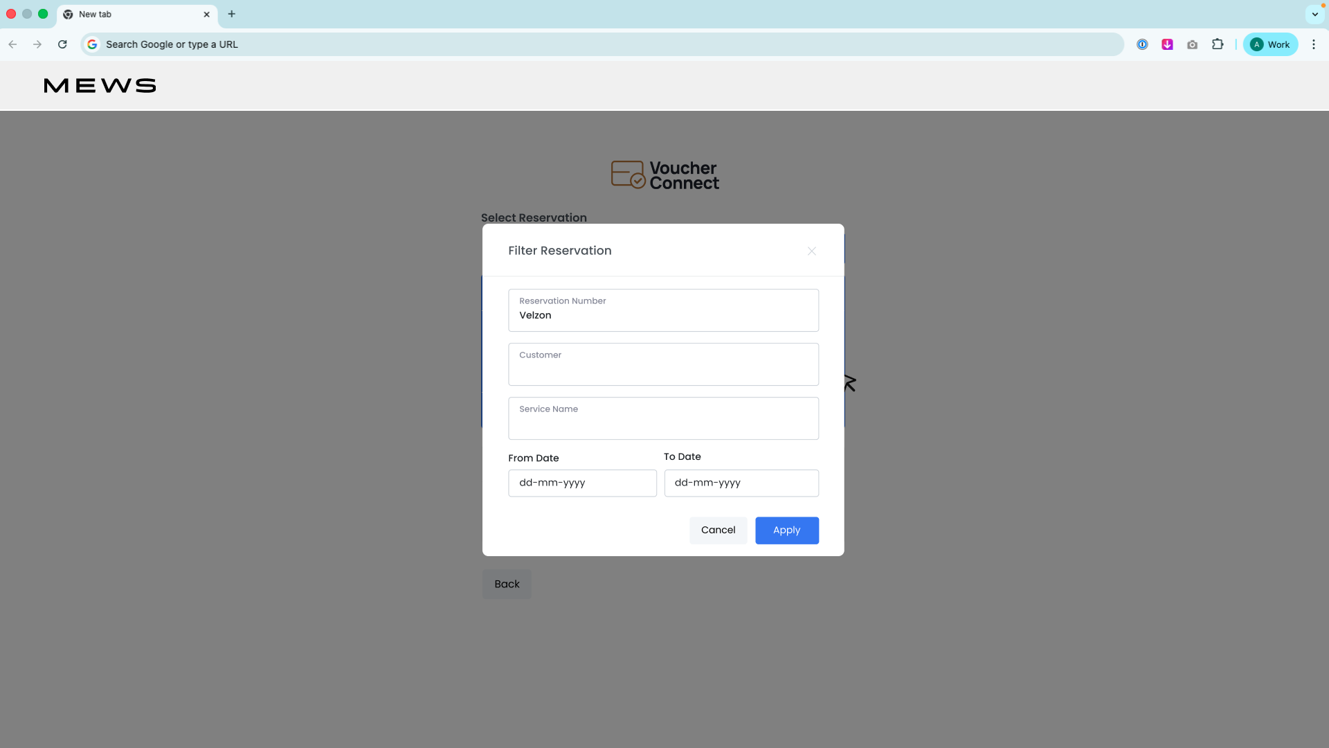
Filtering Reservations
Filters narrow a busy property's booking list down to the guest in front of the desk in seconds, so a search never turns into a scroll through every reservation on the books.
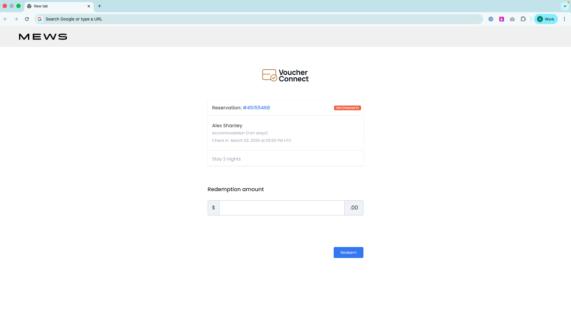
Redemption & Payment
The voucher balance is applied to the selected reservation's invoice with a single Payment Now action — closing the loop from voucher code to settled charge in one screen.
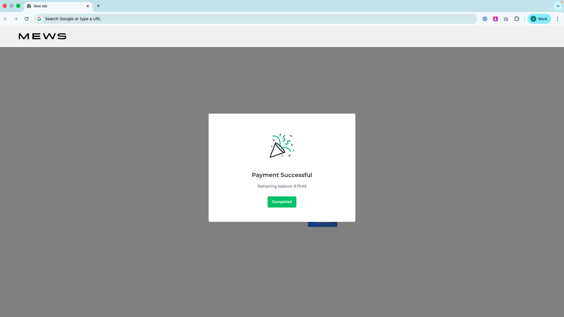
Confirmation
A clear success state confirms the redemption went through, closing the loop for the agent before they move on to the next guest.
Design System Consistency.
Because this integration lives inside a front-desk agent's existing admin tooling, the priority was fitting in rather than standing out. Rather than designing a standalone visual identity, I built the redemption screens on top of the admin design language already in use across the tooling, extending it with product-specific patterns:
Redemption-Specific Patterns
- Single-purpose screens: Each step in the flow (validate, look up, select, pay) is its own screen with one primary action, keeping the agent's attention on a single decision at a time rather than a long form.
- Balance and expiry as first-class fields: Voucher balance and expiry status are surfaced prominently on the detail card rather than buried in secondary text, since they're the two facts most likely to change whether a redemption can proceed.
- Search-first guest lookup: Rather than requiring an exact reservation number, the "Select Reservation" screen supports search with results shown as scannable cards — reservation number, guest, dates, and status together.
Shared Component Library
- Base UI kit: Buttons, alerts, and form elements were documented as a standalone Figma library so every new screen — inside this flow or future ones — draws from the same set of primitives.
- Guided-tour patterns: An "Advance UI" component set was designed to support in-product walkthroughs, anticipating onboarding needs for staff new to the redemption flow.
Deliverables & Outcomes.
The completed Figma file covers the full redemption path end to end, plus the component library it's built on:
| Deliverable | Outcome |
|---|---|
| Voucher validation screen | Single-field code entry with inline validation state |
| Voucher detail card | Store, ID, validity window, and balance surfaced in one view |
| Reservation search & selection | Search-driven guest lookup with card-based results and check-in status |
| Invoice & payment screen | Voucher balance applied to invoice with a single payment action |
| Component library | Buttons, alerts, form elements, and guided-tour patterns documented for reuse |
| Design consistency | New screens built on the existing admin design language for a native feel |
Key Observations.
Redemption Should Feel Like One Step, Not a Reconciliation
A voucher redemption happens with a guest standing at the desk, so every extra field or screen is time the agent spends not talking to them. Splitting the flow into validate → look up → select → pay — each with a single primary action — keeps the process moving without asking staff to hold more than one decision in their head at a time.
Inheriting an Existing Design Language Builds Trust Faster
Because front-desk staff already work inside Mews-adjacent admin tooling all day, a visually distinct "voucher app" bolted on top would have read as an unfamiliar, less trustworthy tool. Building the redemption screens on the existing component patterns meant the new capability felt like it had always been part of the system.
Status Needs to Be Scannable, Not Just Present
Balance, expiry, and check-in status are the three facts that actually decide whether a redemption can go ahead. Treating them as prominent, consistently styled fields — rather than small print — means an agent can glance at a card and know whether to proceed before reading a single sentence.