Group Gifting UI/UX
A deep-dive analysis of the organiser-facing management interface for group gift cards on VoucherConnect — examining information architecture, interaction patterns, usability heuristics, and design opportunities.
01. Product Overview.
VoucherConnect is a smart gifting platform where users purchase and send digital gift cards to restaurants, experiences, and retailers. The Group Gift Card feature lets one person — the organiser — invite multiple contributors to collectively fund a single gift card before it's dispatched to the recipient.
The Transaction Info page is the central management hub the organiser sees after setting up a group gift. It provides a live view of contribution progress, the ability to manage contributors, edit voucher details, and review purchase history — all from a single screen.
02. Context & Mental Model.
The primary user is the gift organiser — someone who has already purchased or initiated the group gift and is now coordinating others to chip in. Their mental model is closer to a shared bill split than an e-commerce checkout.
- Primary Goal: Confirm the gift will be fully funded before the send date and follow up with anyone who hasn't paid yet.
- Secondary Goal: Edit details (recipient email, send date, message) if plans change without disrupting the flow for contributors.
- Anxiety Point: Uncertainty about what happens if not everyone pays in time — will the gift still send? At what value?
- Trust Need: Clear evidence of what each person owes and has paid, without having to chase contributors manually outside the platform.
User Journey Context
This page appears after the organiser completes checkout. They return to it when someone pays, when they want to chase a contributor, or when they need to edit the gift details.
- Browse & select gift card
- Set group, amount & contributors
- Checkout & pay initial share
- Transaction Info page (Current Focus)
- Gift dispatched to recipient
03. Annotated Design.
The page is structured into three distinct zones: a persistent header with brand identity and urgency timer, a two-column content body, and a purchase details footer. Screen states include the Main Organiser View and the destructive Remove Contributor Modal.
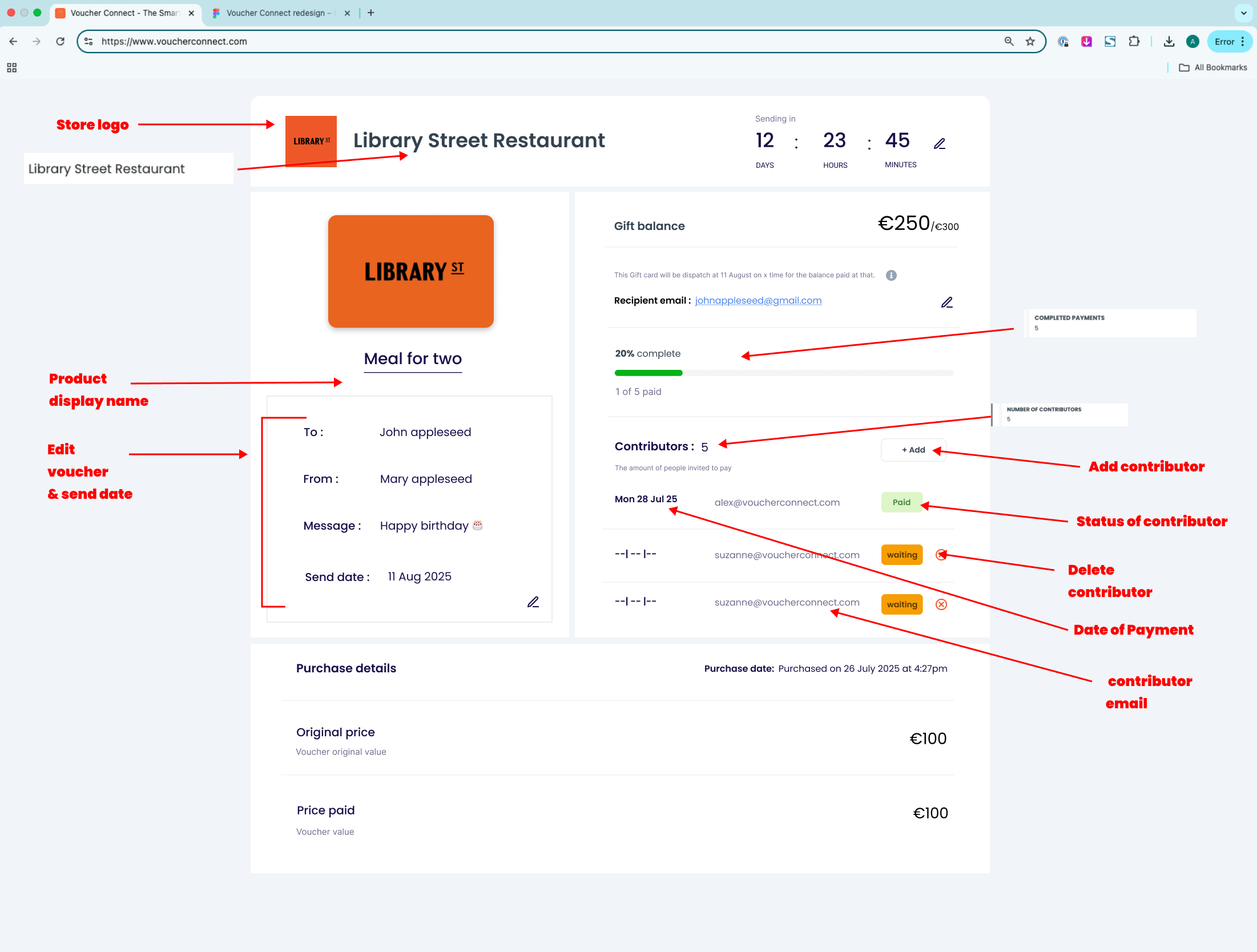
04. Information Architecture.
The page organises a substantial volume of data into three conceptual layers, each serving a distinct temporal frame of reference for the organiser.
| Zone | Purpose | Data Displayed | Temporal Frame |
|---|---|---|---|
| Global Header | Identity & urgency signal | Brand logo, store name, countdown timer, edit button | Future (deadline) |
| Left Panel | Gift card visual and config | Card thumbnail, recipient, sender, message, send date, edit shortcut | Present (confirmed) |
| Right Panel | Core task: track contributors | Balance (current/max), progress bar, contributor list with badges, add button | Present + near-future |
| Footer | Financial record | Purchase date, original price, price paid | Past (completed) |
This temporal layering is a strong architectural decision — the organiser naturally reads top-to-bottom, moving from "what's happening now" to "what happened historically." The header countdown creates immediate time pressure that contextualises everything below it.
05. Component Analysis.
Countdown Timer
Works well: The live countdown creates urgency. Label hierarchy follows standard clock conventions.
Issue: The edit icon (✏) next to the timer is easy to miss. No state exists for when the countdown hits zero.
Gift Balance (€250/€300)
Excellent: Dual-value format sets a concrete "stretch goal" and adds motivational pull.
Accessibility concern: Contrast between €250 and /€300 may fail WCAG AA (4.5:1 against white) for low-vision users.
Progress Bar (20%)
Works well: Triple-encoding progress (bar + % + fraction count) reinforces comprehension.
Missing: What happens at 0% or 100%? The full state should feel celebratory.
Contributor List
Strong design: Hiding the remove button for paid contributors prevents irreversible actions.
Workflow gap: No "Resend reminder" action. Organiser must leave the platform to chase people.
Status Badges
Works well: Colour-coded badges (Green=Paid, Amber=Waiting) distinguish state instantly.
Incomplete: Needs Declined, Partially paid, Expired, and Cancelled variants.
Remove Contributor Modal
Exemplary: "Redistribute amount" vs "Reduce total" previews live financial outcomes with zero mental math.
Button label: "Save" is too ambiguous for a destructive deletion.
Voucher Details Panel
Emotional anchor: The visual gift card reminds them this is a real gift, not just a ledger.
Edit discoverability: Single bottom-right icon covers 4 fields, while an inline edit exists elsewhere.
Purchase Details
Label clarity: "Original price" vs "Price paid" perfectly accommodates discount scenarios.
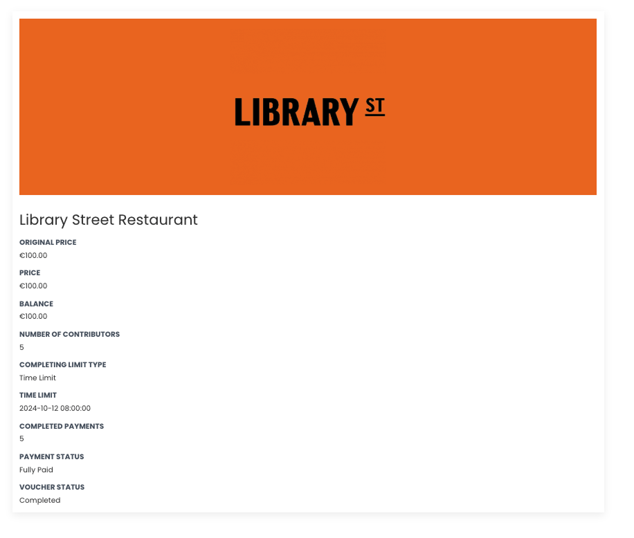
Data gap: "Voucher Status" and "Payment Status" are missing from UI, leaving an anxious organiser guessing.
06. Heuristic Evaluation.
Assessed against Nielsen's 10 Usability Heuristics based on the observed design screens.
| Heuristic | Rating | Evidence |
|---|---|---|
| Visibility of system status | Satisfactory | Progress bar, badge states, and countdown timer all communicate current state effectively. |
| Match with real world | Satisfactory | Language is plain ("Waiting", "Paid") and aligns with social bill-splitting. |
| User control & freedom | Partial | Modal has Close, but no undo for removal, and no way to cancel the group gift. |
| Consistency & standards | Partial | Dual edit affordances create inconsistency. Date placeholder dashes are non-standard. |
| Error prevention | Satisfactory | Removal modal with concrete consequence preview prevents catastrophic mistakes. |
| Flexibility & efficiency | Partial | No bulk actions or resend-reminder shortcuts for busy organisers. |
| Help recover from errors | Needs Work | No error states designed: failed payment, expired invite, send failure. |
07. User Flows.
Flow A — Removing an unpaid contributor
- Sees "waiting" badge on contributor
- Clicks ✕ remove button
- Modal appears: identifies person, amount, and two options
- Selects redistribution choice (Keep total vs Reduce total)
- Clicks Save → Gap: No success state designed. Modal closes with no feedback.
Flow B — Editing the send date
Currently underdefined. The pencil icon implies editability, but changing the send date could affect contributor payment timing. The organiser is left to guess what clicking the icon does without warning of downstream effects.
08. Design Strengths.
This is a thoughtfully conceived interface for a genuinely novel product interaction.
- Consequence-aware modal: Showing live arithmetic outcomes (€62.50 each / New total €200) eliminates anxiety and should be a standard design system pattern.
- Dual-value balance: Showing current collected amount alongside the "fully funded" target (€250/€300) is a smart motivational device.
- Temporal page structure: Organising from future (countdown) → present (contributions) → past (purchase) is highly intuitive.
- Progressive disclosure: Hiding the ✕ button only on paid contributors reduces noise and prevents irreversible actions flawlessly.
09. Design Recommendations.
-
💬
Add "Resend reminder" per contributor ● High Priority
Each "waiting" row should have a bell icon or "Remind" link to send an automated email. This stops users from leaving the platform to chase people.
-
🚨
Design error & edge case states ● High Priority
Define UI states for failed payment, expired invite, partially-funded dispatch, and voucher cancelled.
-
✅
Success state after contributor removal ● High Priority
Show a brief toast notification ("Contributor removed. Amount redistributed.") with a 5-second undo option.
-
📅
Define the send date edit flow ● Medium Priority
Replace ambiguous pencil icon with an "Edit send date" link. Open a modal with a date picker and impact warning ("This will notify all 5 contributors").
-
💡
Surface voucher & payment status ● Medium Priority
Expose "Voucher Status" in the details section. A "Fully Paid — Ready to Send" banner provides major reassurance.
-
🎉
100% funded celebration state ○ Low Priority
When all pay, show an animated full green bar with "Fully funded!" copy. This milestone deserves a distinct visual identity.
10. Before / After.
Old Design
New Design
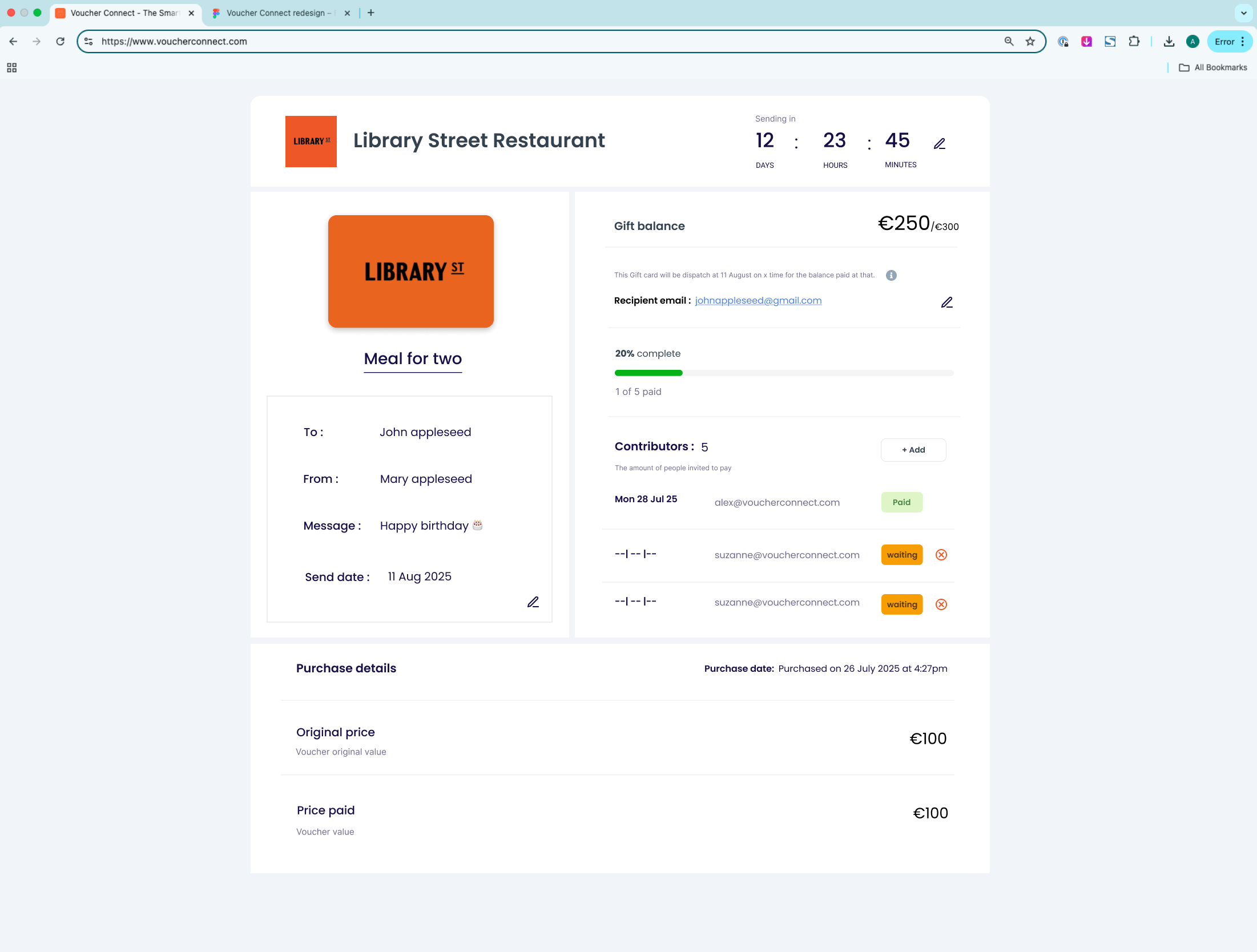
Current Gaps
- No resend reminder action
- No error or failed payment states
- No undo/success feedback on removal
- Ambiguous "Save" CTA on deletions
- Single edit icon for multiple fields
Recommended State
- Bell icon triggers reminder emails
- Full state coverage for edge cases
- 5-second undo toast on destructions
- "Confirm removal" specific CTAs
- Per-field edit icons
11. Conclusion.
The VoucherConnect Group Gift Card Transaction page is a well-considered design for a genuinely complex product interaction. The core information architecture is sound — temporal structuring of content, clear progress signalling, and the consequence-aware removal modal all demonstrate strong UX thinking at work.
The primary gaps lie in workflow completeness (missing resend reminders), state coverage (no error states), and action feedback (no success/undo states). Addressing these would move the design from functional to polished.