Cuban Coffee Queen
A gift card and card carrier design system for Key West's own coffee roaster — built to take the brand off the screen and put it directly in a customer's hand. From the sunshine-yellow card face to the printer's dieline, every layer of this piece was designed to feel like Cuban Coffee Queen, not like a generic gift card.
The Brief.
Cuban Coffee Queen is Key West's own coffee roaster — five locations across the island, freshly roasted Cuban coffee, and a menu of authentic Cuban food built on a brand that leans hard into local culture: the crazy rooster, the crown, the promise to help you "Rule Your Day." That energy lives loudly online, but it didn't yet exist as a physical object a customer could hold, gift, or hang on a rack by the register.
The brief was to design a retail gift card and its printed carrier — the packaging that presents the card in-store — as a matched pair. The card needed to read as Cuban Coffee Queen at a glance, hold up in CMYK at credit-card scale, and connect to a QR-based balance-check and top-up system so staff could skip a manual POS lookup. The carrier needed to work as both shelf packaging and a gift presentation, with fields for who it's to, who it's from, and its value.
The Design System.
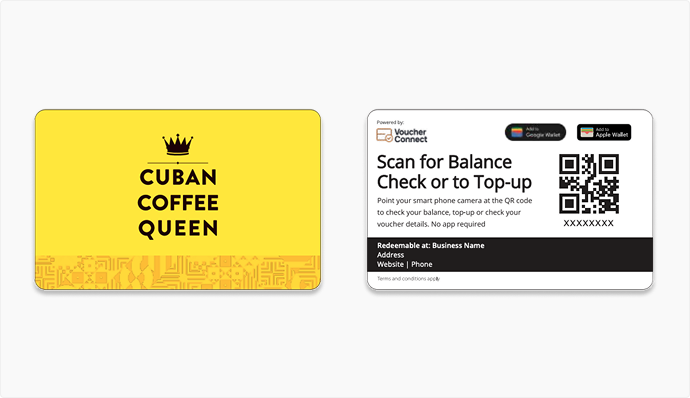
Rather than introduce a new visual language, the card pulls directly from Cuban Coffee Queen's existing brand: the crown mark, the confident sunshine yellow, and a hand-drawn geometric pattern nodding to Cuban tile work. Keeping the palette tight meant the card would be instantly recognizable against every other gift card on the rack.
The Gift Card.
The card front is deliberately spare: crown, wordmark, a hairline rule with a single diamond — all sitting on a solid field of yellow with a textured pattern band anchoring the bottom third. The back does the functional work, integrating the Voucher Connect balance-check system with a QR code, Apple Wallet and Google Wallet badges, and a redemption footer bar carrying location and contact details.
The Card Carrier.
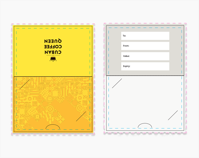
The carrier is the piece that does the selling before the card is ever scanned — a standard backer, no hanger tab, sized to hold the card in a slot on the inside panel. The front mirrors the card's yellow-and-pattern treatment so the two read as one object on the shelf. The inside trades brand moment for utility: To, From, Value, and Expiry fields laid out for a customer to fill in by hand when giving the card as a gift.
Production Detail.
Retail gift cards live or die on production accuracy — the artwork had to be built to the printer's exact dieline, with every safety margin respected before a single file left the studio:
Card Format
CMYK, 3.375" × 2.125" — standard credit-card scale, rounded corners.
Carrier Format
4.25" × 5.75" standard backer, no hanger tab, 8-up press layout.
Bleed & Safety
1/8" minimum bleed on all edge-to-edge artwork, 1/8" text and graphic safe zone inside the trim.
Balance & Top-Up
Voucher Connect QR integration with Apple Wallet and Google Wallet, no app required to scan.
File Prep
Illustrator dieline workflow — FPO and Artwork on separate layers, all type converted to outlines before handoff.
Print Partner
Produced through Plastic Printers, Hastings, MN — proofed in CMYK ahead of press.
Results & Outcomes.
| Deliverable | Outcome |
|---|---|
| Card faces | Front and back designed and proofed in full CMYK |
| Carrier panels | Front and inside panels designed to standard backer dieline |
| Wallet integration | Apple Wallet and Google Wallet linked via on-card QR |
| Balance system | Voucher Connect scan-to-check and top-up, no app required |
| Brand consistency | Crown mark, sunshine yellow, and Cuban tile pattern carried across both pieces |
| Print readiness | Outlined type, dieline-accurate artwork, delivered production-ready |
Key Observations.
A Gift Card Is a Billboard That Fits in a Wallet
Every gift card that leaves the store keeps working after the sale — sitting in a wallet, appearing at checkout, getting handed to a friend as a gift. Designing it with the same discipline as any other brand touchpoint, rather than treating it as an afterthought of the checkout process, was the priority from the start.
The Carrier Sells Before the Card Does
On a physical shelf, the carrier is what a customer actually picks up first. Mirroring the card's yellow field and pattern band onto the backer meant the two pieces read as a single, considered object rather than a card stapled to generic packaging.
Production Constraints Are Part of the Design, Not a Limit On It
Bleed lines, gutters, dieline curves, and 8-up press layouts aren't obstacles to a clean design — they're the frame it has to be designed inside of. Building to the printer's exact spec from the first draft meant no surprises between the proof and the finished card.