Boy to Man ISTD.
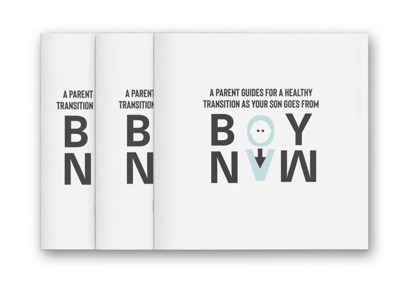
An editorial and typographic design project for the ISTD, developed from research into men's mental health into an illustrated parenting book, Boy Now, built to help parents of young sons understand how differences in upbringing shape emotional development.
The Brief.
The ISTD brief asked for the concept of spaces between to be considered in a conceptual and physical way, thinking about how these spaces connect or disconnect people, places, ideas and cultures, investigated from individual, cultural and human perspectives. It's a deliberately open brief, and the widest interpretation was the point, giving room to draw on genuinely different experiences of the theme rather than converge on one obvious reading.
The project began as an analysis of men's mental health and the disproportionate rate at which men take their own lives, an issue that felt personally significant enough to build a whole body of research around. That research, and feedback through several pitches and revisions, led to a consistent conclusion: many men feel they cannot talk about what they are feeling, and that pattern traces back to childhood, to how boys are parented differently from girls from a very early age. The spaces between became the gap between how sons and daughters are raised, and the emotional distance that gap can create between fathers and sons.
Concept & Rationalization.
The finished publication, Boy Now, is a comprehensive parenting book aimed specifically at parents of sons between the ages of 3 and 7. It sets out to inform parents about the real differences between how boys and girls process and express emotion, and how treating sons and daughters identically, without accounting for those differences, can leave parents unable to properly read or support their son's emotional state as he moves through early childhood.
Choosing that age range and audience was a deliberate research decision, not just a design one. Ages 3 to 7 sit at the foundation of a child's emotional development, and working exclusively with boys kept the research focused on the pattern the project set out to investigate, rather than diluting it across a broader, more generic parenting audience.
Deliverables & Scope.
The brief called for a full editorial system, not just a single finished piece, meaning the project had to hold together across research, specification and final print production:
Typography System.
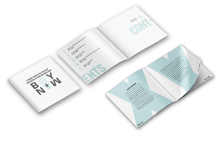
The book's central idea, that boys are raised to value action over words, shaped the typographic system directly. Headlines and pull quotes were given a bold, physical presence, while body copy stayed warm and easy to read, so the two voices of the book, urgent and reassuring, sat clearly apart on the page:
Headline: Bison
A bold, condensed display face used for headlines and pull quotes, chosen for its blunt, physical weight, echoing the book's own argument that boys are taught to respect action over words.
Body Copy: Vedenna
A humanist sans-serif used throughout the body copy, kept warm and highly legible so the parenting guidance itself always reads as approachable rather than clinical.
Expressive: Neue Haas Unica W1G Bold
Used for expressive section markers and standout statements, giving the system a second, looser voice alongside the more rigid headline type.
Wordmark
A hand-illustrated Boy Now logotype, built from rounded, slightly imperfect letterforms in blue with a red accent, giving the book a warmer, more human identity than the typographic system alone.
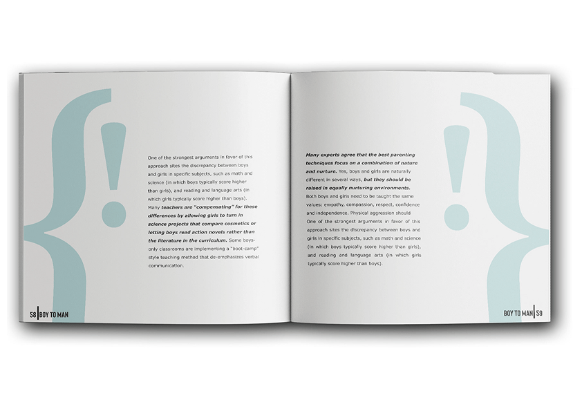
The pull quotes carried the book's research directly onto the page. Spreads like Boy's Respect Action Over Words and Not Better Not Worse Just Different were built to work as standalone statements, readable at a glance even by a parent flicking through rather than reading start to finish, while longer features such as How Boys and Girls Play Different paired research findings with illustration to make the underlying behavioural research feel concrete rather than abstract.
From Dummy to Final Print.
Moving from a working dummy to a finished, printed publication meant treating production as part of the design process, not a separate stage handed off at the end. The document itself was set up as a custom 8.5 by 8.5 inch square format, four pages with facing pages enabled, a four column grid on every spread, and a consistent 0.5 inch margin on the top, bottom, inside and outside edges, giving the layout a stable structural grid to design every spread against from the start.
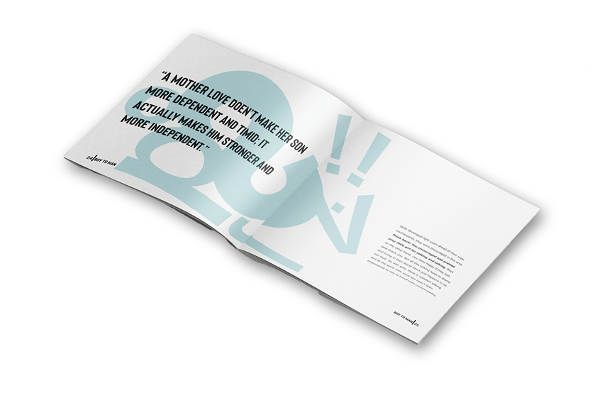
- Dummy publications: Working mockups built to test pacing, pagination and how the typographic system actually read across spreads before committing to final print.
- Paper and binding: Paper samples and a final binding solution selected to suit the tone of the publication.
- Print management: A print plan outlined and the job booked with the printer against an agreed timeline, treating production scheduling as a real part of the deliverable rather than an afterthought.
- Feedback incorporation: Feedback from the ISTD Publication folded back into the final piece, rather than treating the first bound copy as untouchable.
Results & Outcomes.
The completed project delivers a full editorial system built around a single, considered concept, from first sketch through to finished print:
| Deliverable | Outcome |
|---|---|
| Concept | Men's mental health research narrowed to an illustrated parenting book for sons aged 3 to 7 |
| Research | Tabbed sketchbook documenting the men's mental health research and childhood parenting studies |
| Typography system | Bison headlines, Vedenna body copy and Neue Haas Unica W1G Bold expressive markers |
| Document setup | Custom 8.5 by 8.5 inch square format, four column grid, 0.5 inch margins throughout |
| Dummy publications | Working mockups used to test layout and pacing ahead of final print |
| Print production | Printed cover, paper samples and a finished binding solution |
| Print management | Print plan documented and the job booked to an agreed timeline |
| Final delivery | Bound Boy Now publication with a finished binding solution |
Key Observations.
A Personal Reason Makes an Open Brief Specific
Spaces between could mean almost anything, which is exactly what made it difficult. Narrowing the brief down through real research, men's mental health, the gap in how boys are parented, and a specific audience of parents with sons aged 3 to 7, gave the project an actual point of view to design around, rather than trying to represent every possible interpretation at once.
Typography Can Argue the Book's Own Point
The book's thesis is that boys are raised to respect action over words. Giving headlines and pull quotes a bold, condensed typeface while keeping body copy warm and humanist isn't just a stylistic choice, it lets the typographic system itself demonstrate the exact contrast the research is describing.
Production Specs Are Part of the Concept
A custom square trim size, a four column grid and consistent margins aren't just technical housekeeping. Setting that structure deliberately, before a single spread was designed, gave every page the same disciplined foundation to build from, so the final printed book held together as one considered object rather than a collection of individually designed pages.