My Account Redesign.
A UX/UI redesign of Voucher Connect's account settings screen, taking a bare legacy form and turning it into a grouped, secure, and genuinely usable settings experience that matches the rest of the redesigned platform.
The Brief.
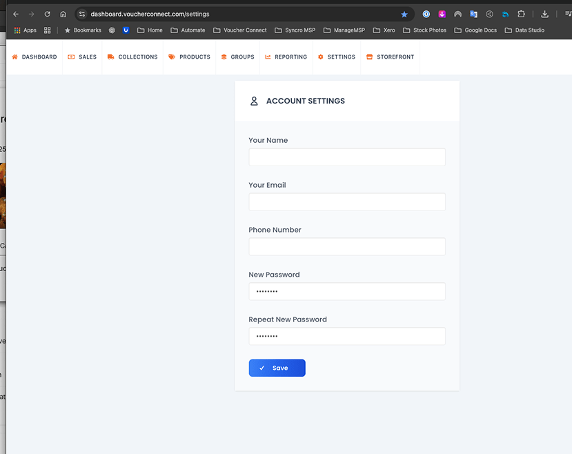
The original account settings screen was a single flat form: Name, Email, Phone Number, New Password, Repeat New Password, and one Save button with no confirmation state beyond a checkmark icon. It worked, but it hadn't been touched since an earlier version of the platform and it showed, sitting inside an older dashboard navigation with no visual connection to the rest of the redesigned product.
The brief was to bring this screen in line with the wider platform redesign: group related settings into clear sections, add the security features a modern SaaS dashboard is expected to have, and remove the small usability gaps, no password visibility toggle, no context for why a field is needed, no clear save or discard state, that had quietly persisted in the original.
Before & After.
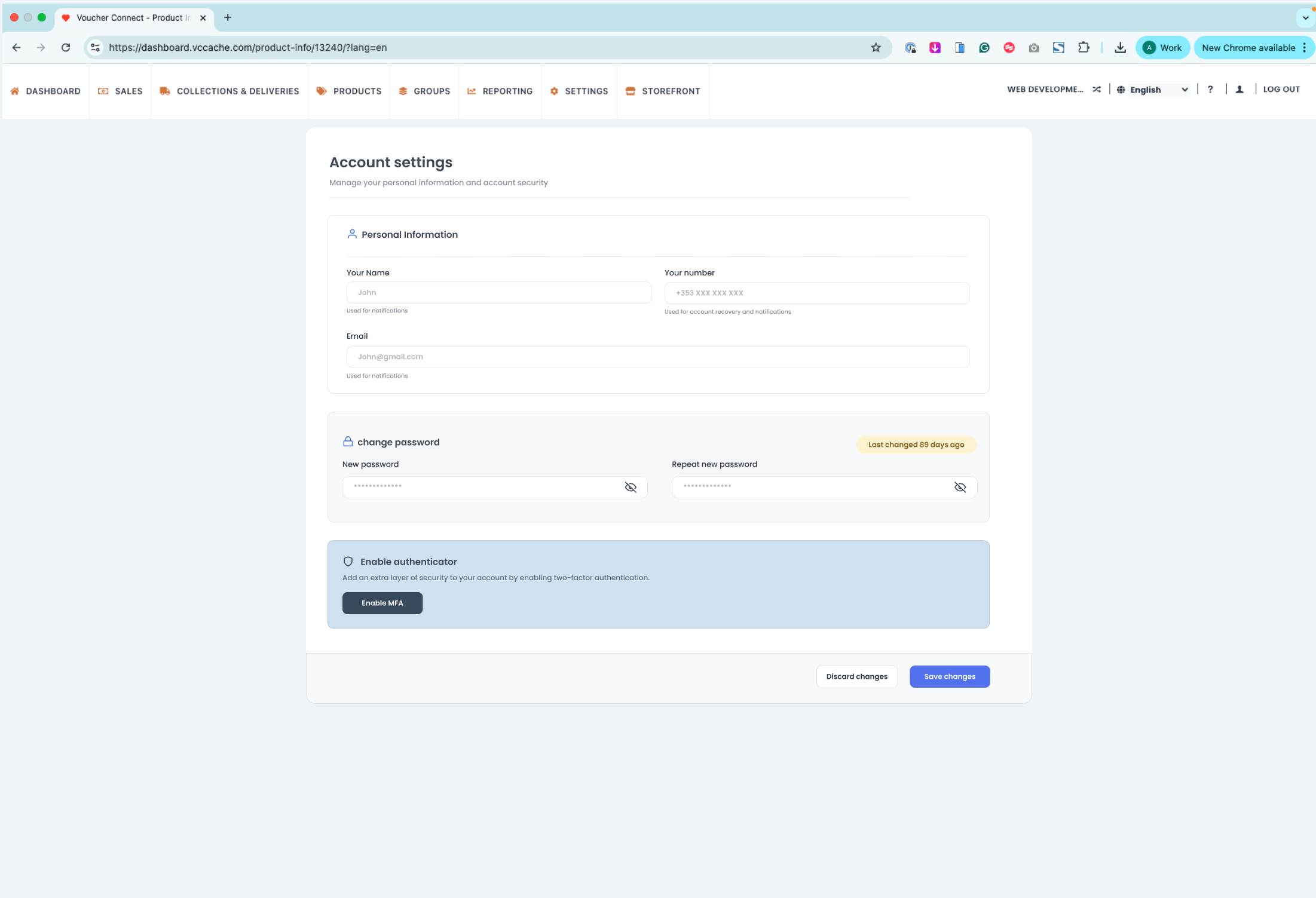
The two versions sit on opposite ends of what a settings screen can be: one a bare, unstructured form, the other a grouped, secure, and clearly labelled experience.
What Changed.
Every change made to this screen was aimed at either clarity, structure, or security, the three things the original form was missing:
Grouped Sections
Personal Information, Change Password, and account security split into their own distinct cards instead of one continuous list of fields, so each part of the screen has a clear purpose.
Two Column Layout
Name and phone number placed side by side rather than stacked full width, using the available screen space more efficiently on larger displays.
Contextual Helper Text
Short helper copy added under each field, "Used for notifications," "Used for account recovery," so the purpose of every input is clear without needing to guess.
Password Visibility Toggle
A show and hide icon added to both password fields, closing a basic usability gap that existed in the original form.
Last Changed Indicator
A "Last changed X days ago" badge added next to the password section, giving the account holder context they previously had no way of seeing.
Two Factor Authentication
A dedicated Enable Authenticator card added as its own highlighted section, a security feature that did not exist anywhere in the original screen.
Navigation & Save State.
Two further changes sat outside the form itself but mattered just as much to how the screen feels to use:
- Consistent top navigation: The mixed-style icon set and inconsistent visual weight in the original top navigation was replaced with a single consistent icon and typography system, tying this screen back to the rest of the redesigned dashboard.
- Explicit save and discard actions: The single ambiguous checkmark-only Save button was replaced with clearly labelled Discard Changes and Save Changes actions, so the account holder always knows exactly what happens next.
Results & Outcomes.
The finished redesign gives Voucher Connect an account settings screen that reads as part of a considered product rather than a leftover legacy form:
| Deliverable | Outcome |
|---|---|
| Screen structure | Flat single form rebuilt into grouped Personal Information and Security cards |
| Layout | Two column field layout used where space allowed, reducing unnecessary scroll |
| Helper text | Contextual copy added under every field explaining its purpose |
| Password fields | Visibility toggle added to both password inputs |
| Security | New two factor authentication card added to the account security section |
| Save state | Explicit Discard Changes and Save Changes actions replacing a single icon-only button |
| Navigation | Top navigation brought in line with the wider platform's design system |
Key Observations.
A Flat Form Is Not a Settings Page
Six fields under one heading with a single save button looks simple, but it forces the user to hold the structure of the page in their own head. Grouping the same fields into Personal Information and Security sections does the organisational work for them, and makes the screen easier to scan even though nothing about the underlying data changed.
Helper Text Removes Guesswork That Erodes Trust
A phone number field with no explanation leaves the user wondering whether it will be used for marketing, recovery, or something else entirely. A single line of helper copy under each field answers that question before it's asked, which matters more on a security-adjacent screen like this one than almost anywhere else in the product.
Security Features Have to Be Visible to Be Trusted
Adding two factor authentication only has value if account holders actually notice it exists. Giving it its own highlighted card, rather than burying it as a small toggle at the bottom of the form, was a deliberate choice to make the platform's security posture visible rather than assumed.