My Stores Redesign.
A UX/UI redesign of Voucher Connect's account selector screen, the page a merchant lands on straight after login to choose which store they're managing, taken from a functional but flat utility screen to a considered, branded product moment.
The Brief.
Voucher Connect account holders can manage more than one store from a single login, so the screen that sits between authentication and the dashboard has one job: let a merchant identify and select the right store, quickly and without confusion. The existing version of this screen worked, but it read as a generic account switcher rather than a considered part of the product, a plain list with little visual identity and no real sense of which store was which beyond a name.
The brief was to modernise this screen so it felt intentional: give each store a visual identity, keep every functional action clearly within reach, and avoid the trap of over-designing a screen that people move through quickly on their way to actual work.
Exploring the Layout.
Before settling on a final direction, I worked through several layout approaches rather than jumping straight to a single solution:
- Single column list: The simplest option, but it read as little more than a styled dropdown menu and didn't give any individual store a real identity.
- Dense card grid: Every store presented as an equal-weight card in a grid. This solved the identity problem but competed visually with the card patterns already used elsewhere in the product, making the screen feel repetitive rather than distinct.
- Split panel: A two-panel layout, with imagery given its own space on one side and every functional control grouped on the other. This is the direction that was ultimately developed and refined.
The Final Layout.
The finished design splits the screen in two: a dynamic image carousel on the left that rotates through store and brand photography, and a right-hand panel that holds every functional element, store selection, search, and account actions. Splitting the screen this way let each half do one job well, instead of asking a single panel to be both visually expressive and functionally dense at once.
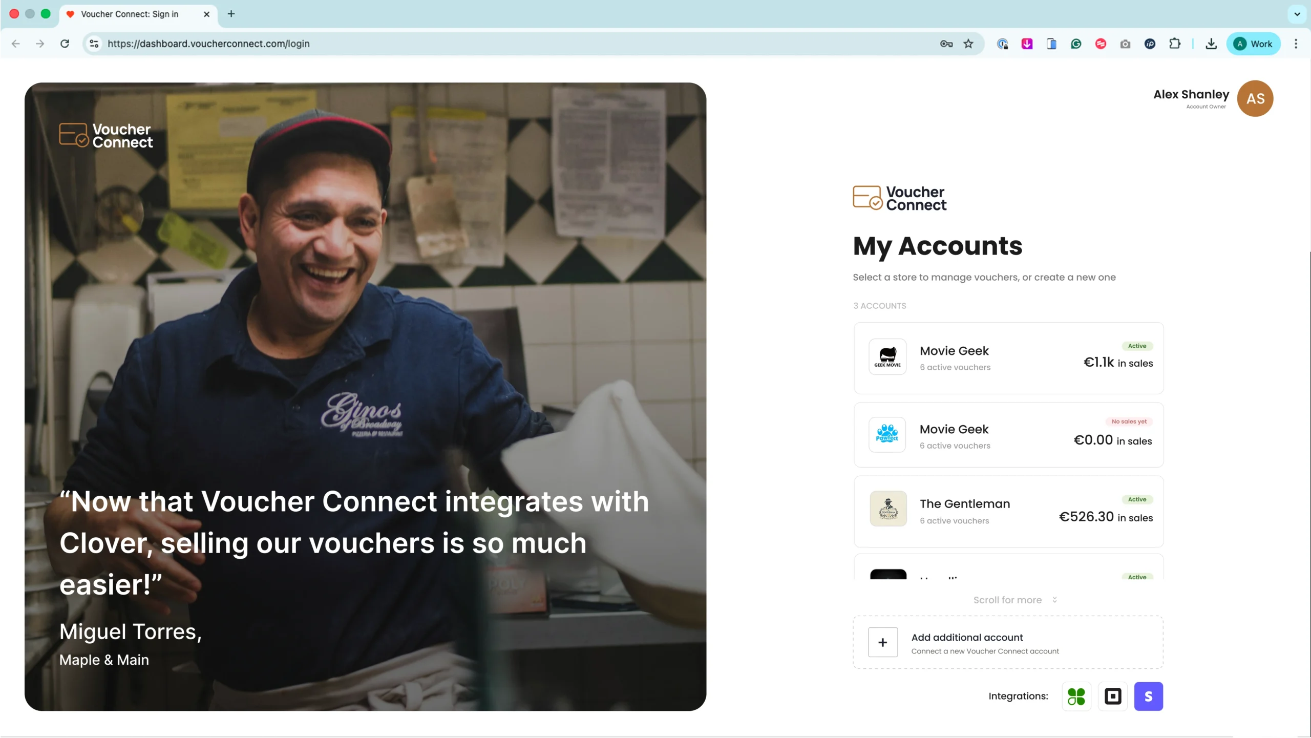
The finished design: dynamic image carousel on the left, full functional panel on the right.
Dynamic Image Carousel
Rotating store and brand imagery fills the left panel, giving each account a visual identity instead of a plain list row with a name.
Card Based Store Selector
Individual stores presented as cards with clear hierarchy, name, status and quick actions all scannable at a glance rather than buried in a dense table.
Pill Style Actions
Account level filters and actions built as pill selectors, keeping the interaction language consistent with the rest of the Voucher Connect design system.
Floating, Airy Composition
Generous spacing and floating elements used in place of heavy bordered panels, keeping the screen feeling light rather than boxed in.
Restraint by Design.
A screen like this is easy to over-build. Every functional idea, live summaries, extra banners, contextual hint panels, can feel useful in isolation but adds friction to what should be a fast, low-effort step. The design was deliberately kept minimal: purposeful copy that tells the merchant exactly what they need to know, no more, and no functionality added before there's a clear reason for it. That discipline was applied consistently across every iteration of the screen, not just the final version.
Results & Outcomes.
The finished design gives Voucher Connect a store selector screen that carries real product identity rather than functioning as a bare utility step:
| Deliverable | Outcome |
|---|---|
| Layout exploration | Three distinct directions tested before converging on the final split panel approach |
| Final structure | Dynamic image carousel paired with a dedicated functional panel |
| Store selector | Card based system with clear name, status and action hierarchy |
| Interaction language | Pill style actions consistent with the wider Voucher Connect system |
| Visual language | Light, airy, floating element composition in place of heavy bordered panels |
| Copy | Minimal, purposeful contextual copy with no premature functionality |
Key Observations.
The Right Layout Rarely Shows Up First
The single column list and dense card grid both looked plausible on paper, but neither one actually solved the underlying problem until they were tested against real content. Working through multiple directions before committing is what surfaced the split panel approach as the one that actually fit the job.
Two Panels Doing One Job Each Beats One Panel Doing Everything
Asking a single layout to be visually expressive and functionally dense at the same time tends to compromise both. Giving imagery its own space and functionality its own space let each side of the screen be fully committed to its job, rather than a diluted version of both.
Restraint Has to Be a Deliberate Choice, Not a Default
It's easy to keep adding to a screen like this: another banner, another summary, another hint panel. Every one of those looks reasonable in isolation. Actively deciding what to leave out, and holding that line through every iteration, is what kept the final screen feeling fast and considered rather than cluttered.