Avoca Wicklow Day Tour
A complete visual redesign for a second-generation family-run luxury chauffeur experience through County Wicklow — originally created by Norman Dowling and now carried forward by his son Brian. The brief was to build a digital presence that matches the quality and warmth of the experience itself: seven magnificent stops, a €750 private luxury minivan, and TripAdvisor reviews from guests across Europe and North America, all presented with the restraint and confidence of a premium Irish tourism brand.
The Problem.
The Avoca Wicklow Day Tour is a genuinely exceptional product — a private chauffeured journey through some of Ireland's most photographed landscapes, run by a family with decades of local knowledge, glowing TripAdvisor reviews in five languages, and a client base spanning the US, Germany, France, and beyond. The original website told a very different story.
Cluttered, visually inconsistent, and built on a generic template, it actively undercut the quality of the experience it was meant to represent. For a product competing in the premium end of Irish tourism — where a guest is choosing between this and a luxury hotel experience — the digital presence is the first and most critical trust signal.
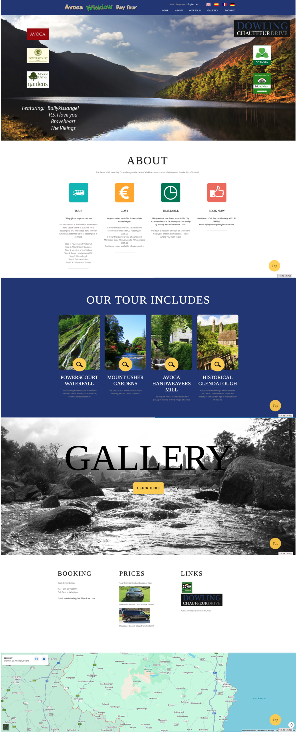

What the original site was getting wrong
- Conflicting visual identity: Multiple logos and competing widgets with no clear hierarchy. The redesign introduces a single cohesive dark navy identity with warm gold and white — immediately signalling premium positioning.
- Low-quality visual language: Heavy use of stock-style icons and small imagery. The redesign leads every section with full-bleed landscape photography — letting Powerscourt, Glendalough, and Guinness Lake do the selling.
- Visual whiplash between sections: Clashing background colours with no coherent design system. The redesign uses a controlled typographic hierarchy with Playfair Display serif headings and clean Manrope body text throughout.
- Buried pricing: The €750 price point was difficult to find and presented without confidence. The redesign displays it prominently — filtering for serious bookers and signalling that the experience is worth it.
- No social proof integration: TripAdvisor reviews — in English, French, and German — were not woven into the page. The redesign surfaces them at the point of maximum hesitation.
- No upsell architecture: The broader Dowling Chauffeur Drive portfolio (Cliffs of Moher, Belfast, Kerry, Golf, Whiskey Tours) had no elegant presentation. The redesign introduces a Bespoke Luxury Tours section that turns one booking into a repeat relationship.
Key Design Decisions.
Six core choices that changed how the brand is perceived from the first scroll:
Full-Viewport Hero
A cinematic opening image of the luxury minivan against the Wicklow hills immediately anchors the brand in premium transport and natural beauty — setting expectations before a word is read.
Price Up Front
The €750 figure is displayed prominently and without apology. This filters in serious bookers, filters out bargain hunters, and signals that the experience justifies the investment.
Reviews Woven In
TripAdvisor ratings and multilingual guest testimonials (English, French, German) are integrated into the page flow — not hidden in a footer — building trust at the exact point where hesitation lives.
Visual Journey Gallery
A rich multi-image gallery of all seven stops replaces the old button-to-gallery link — giving visitors an immersive feel for the experience before they commit to booking.
Bespoke Tours Upsell
Six additional tour experiences (Cliffs of Moher, Belfast, Kerry, Whiskey, Golf, Dublin City) are presented as a curated collection — elegantly turning one booking into a repeat relationship with Dowling Chauffeur Drive.
Contact Simplicity
A clean concierge-style contact form at the page foot removes all friction from the final conversion step — with US Toll Free (1800 305 3667), Irish mobile, and WhatsApp all immediately accessible.
Design Direction.
Restraint is a luxury signal. The redesign draws on the visual language of premium Irish and European travel brands — dark navy as a foundation of trust and depth, warm gold as an accent that communicates craftsmanship and warmth, and generous white space that lets the landscape photography breathe. These are not decorative choices; they communicate credibility instantly to a visitor who has dozens of tour options and will decide in seconds whether this one feels right.
Brand Colour Palette
Results & Outcomes.
| Deliverable | Outcome |
|---|---|
| Visual identity | Unified dark navy, gold, and linen palette replacing a cluttered multi-colour template |
| Hero section | Full-viewport cinematic imagery replacing a text-heavy above-the-fold |
| Pricing presentation | €750 prominently anchored — from buried text to a confidence signal |
| Social proof | Multilingual TripAdvisor reviews integrated into page flow from footer-only |
| Tour stops | All 7 stops presented with dedicated imagery and descriptions |
| Vehicle fleet | Ford Tourneo, Mercedes E Class, and V Class presented with pricing |
| Upsell architecture | 6 Bespoke Luxury Tours presented as a curated collection |
| Contact & booking | Concierge form with US Toll Free, Irish mobile, and WhatsApp all surfaced |
Key Observations.
The Digital Presence Must Match the Physical Experience
A guest choosing the Avoca Wicklow Day Tour is spending €750 on a private luxury experience with a family who has been running this route for generations. The original site made that feel like a €30 group bus tour. The single most important outcome of this redesign is alignment — the website now feels like it belongs to the same world as the leather seats, the privacy glass, and the fifth-generation guide who knows every stone in Glendalough.
Pricing Confidence is a Luxury Signal
Displaying a €750 price point prominently, without hedging or burying it in a contact form, is a counterintuitive but powerful design decision for a premium product. It communicates self-assurance, repels the wrong audience, and tells the right audience — the traveller who values quality over cheapness — that this is exactly the kind of experience they were looking for.
Reviews in the Right Place Outperform Reviews in the Right Volume
The original site had access to the same TripAdvisor reviews — multilingual, enthusiastic, and detailed. The redesign placed them at the point of maximum purchase hesitation: after the price reveal, before the booking CTA. The content didn't change. The placement did. That is the difference between a review section and a conversion tool.