Voucher Connect
Log In Page.
The design and UX specification for the modernization of the Voucher Connect dashboard login page. This project represents a focused redesign of the primary entry point used by thousands of businesses globally, introducing a dynamic split-screen layout to build user trust and communicate brand value.
Executive Summary.
The redesign addresses identified weaknesses in the existing login experience: an outdated visual aesthetic, a poor first impression, and a lack of brand confidence at the most critical trust moment—when a business owner or staff member first signs in. The new design introduces a modern, dynamic split-screen layout that communicates brand quality, builds user trust, and aligns the login experience with the sophistication of the platform behind it.
Objective 01
Modernise the visual design of the login page to match the quality and ambition of the wider Voucher Connect platform.
Objective 02
Improve the first impression and perceived trustworthiness of the platform for new users arriving at the dashboard.
Objective 03
Introduce dynamic, brand-reinforcing content to the login screen that communicates platform value while users sign in.
Objective 04
Maintain full functional parity with the existing login experience—same fields, same flows, improved presentation.
Current State.
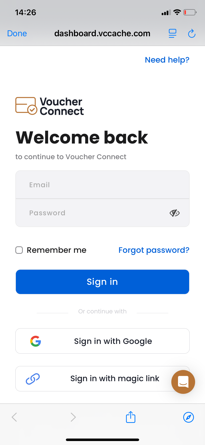
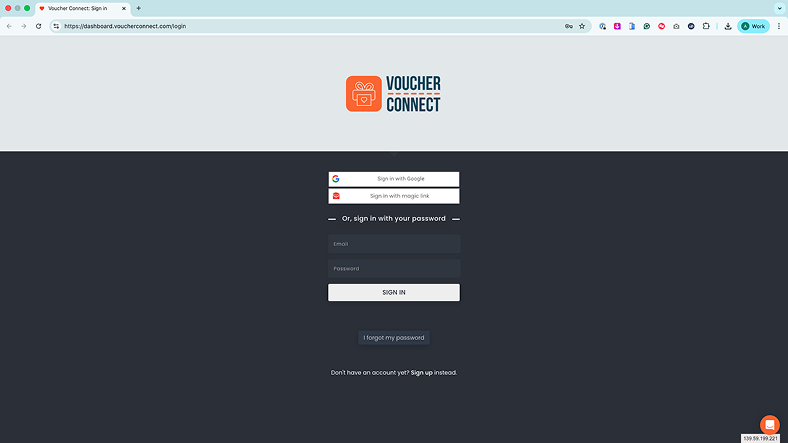
The existing login page suffered from an outdated, generic aesthetic that failed to inspire confidence. The single-column layout wasted screen real estate on desktop monitors, and the page completely lacked any value communication or trust signals beyond a basic logo.
Design Process.
Following a discovery phase auditing the existing page against current UX best practices, two distinct rough layout concepts were explored before committing to high-fidelity design.
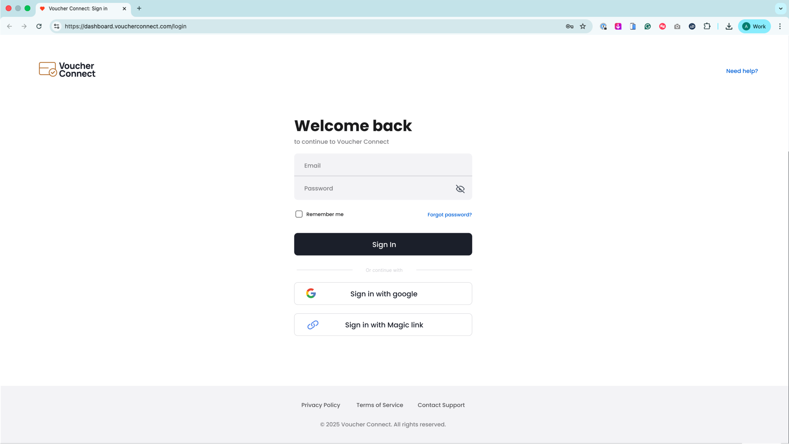
The rough sketches explored two primary approaches: a centred single-column form with strong brand imagery, and a split-screen layout dividing the screen between a login form and a brand/value panel. The split-screen layout was selected as it better utilizes desktop screen real estate and provides a dedicated space to communicate platform value dynamically.
Final Design.
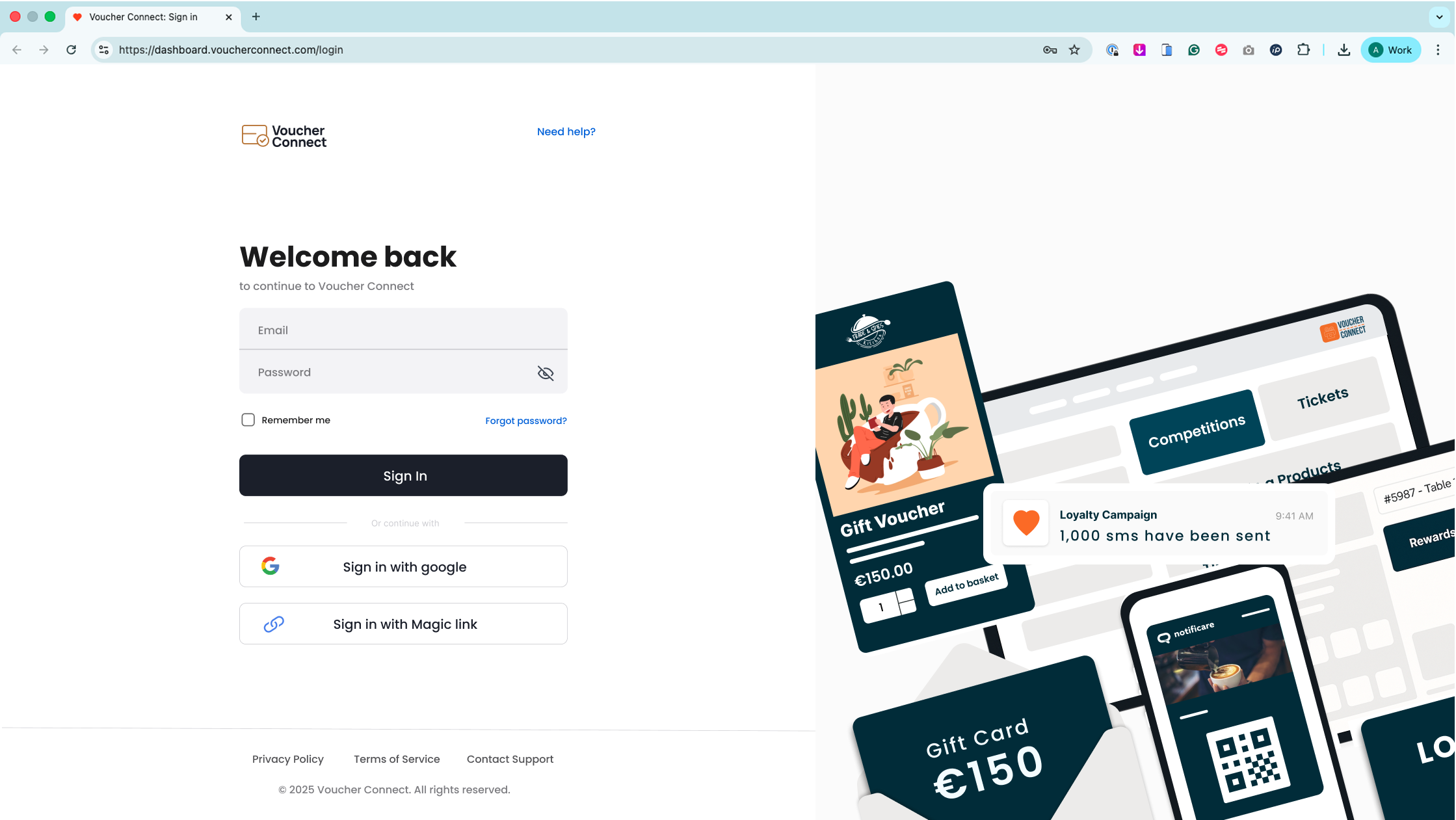
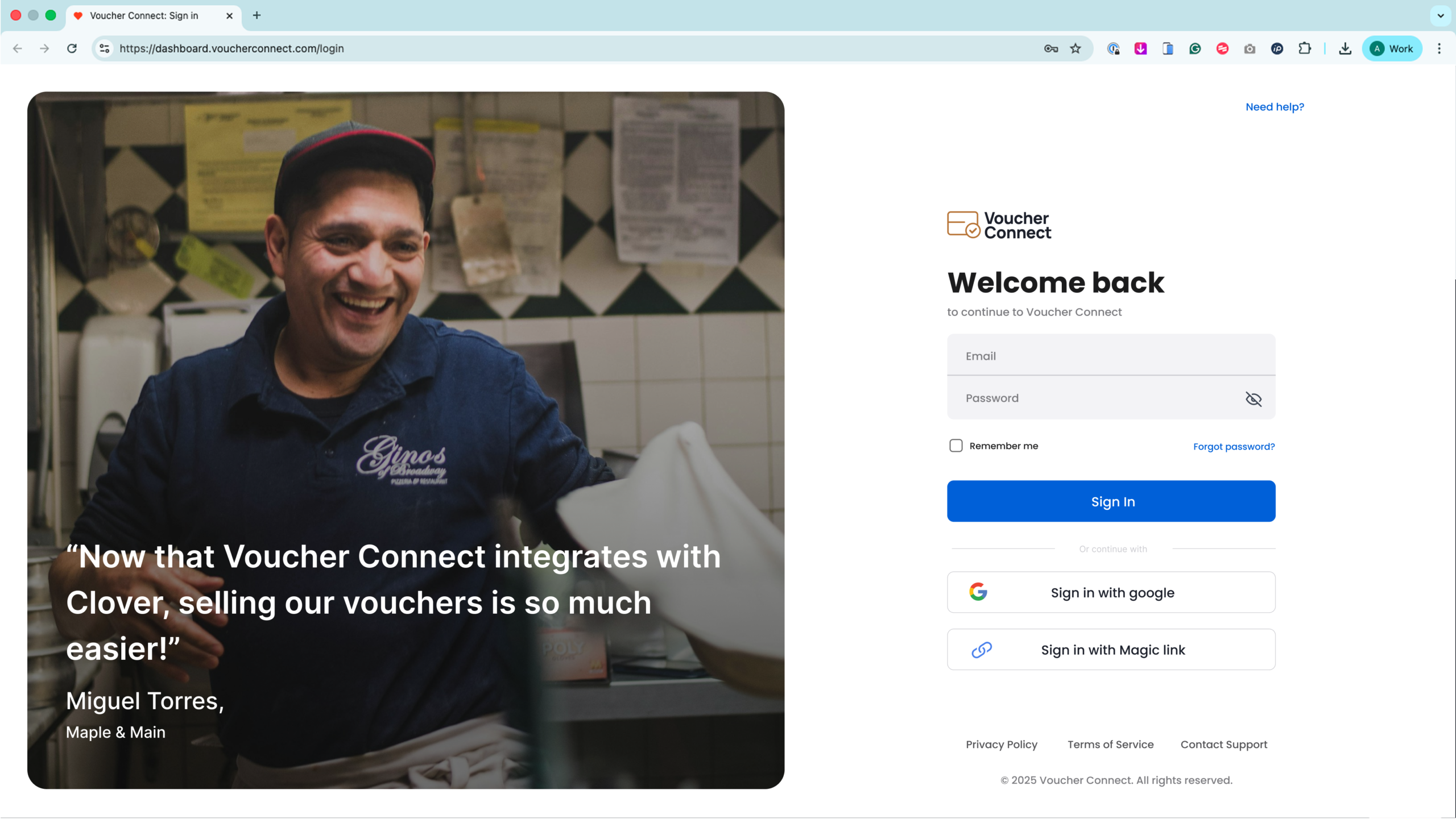
The final design uses a dynamic split-screen layout, dividing the viewport into two distinct zones:
- Left Panel (55%): The Brand & Value Zone. Utilises the Voucher Connect purple (#6B3FA0) to establish brand recognition, communicate platform value, and display social proof (1,000+ businesses worldwide).
- Right Panel (45%): The Login Form Zone. A clean white panel for maximum legibility, housing the login fields, password reset link, and sign-up CTA.
UX & Responsive Logic.
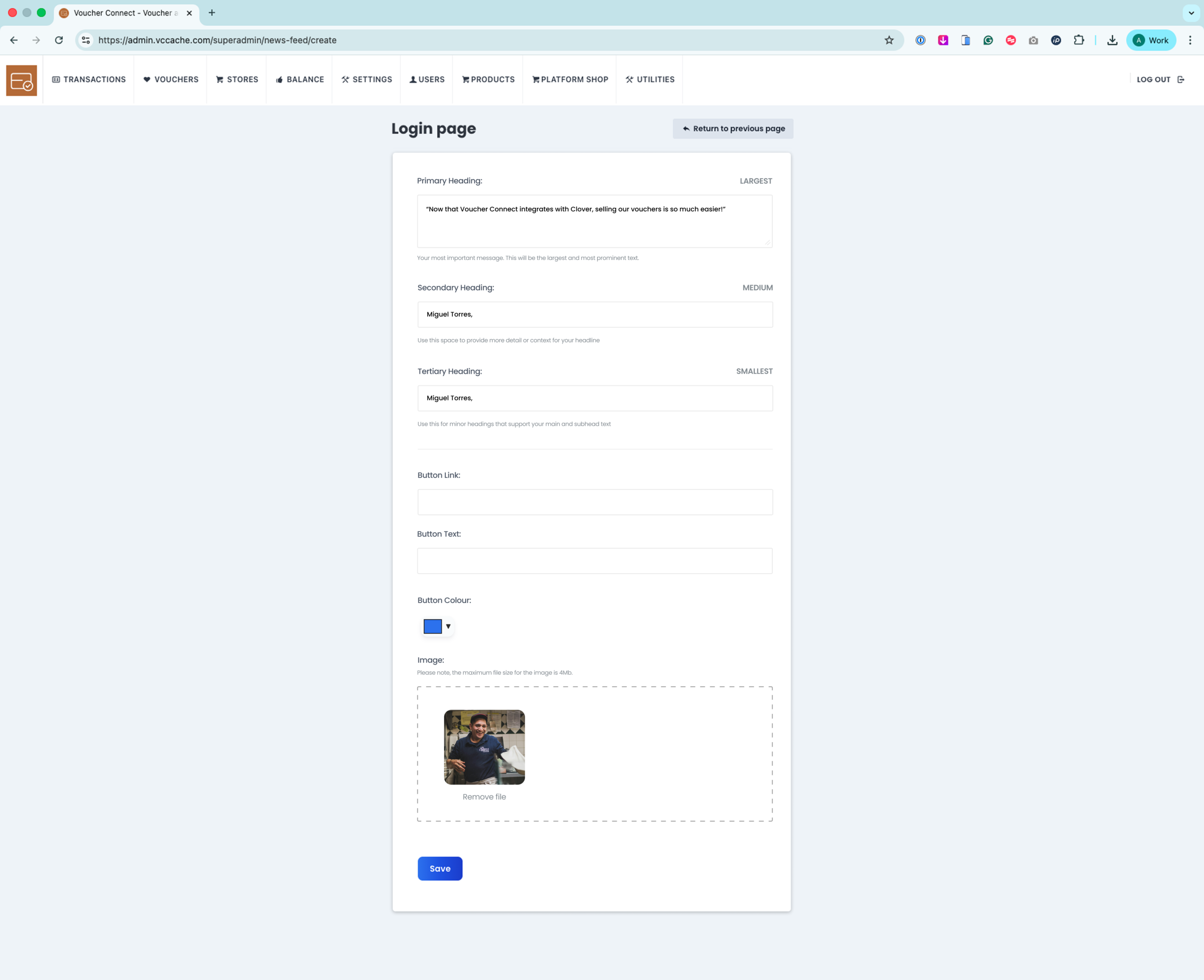
A key differentiator in the new design is the dynamic aspect of the left panel. Rotating value proposition messages cycle every 5 seconds, transforming the login screen into a passive product education moment. Example messages include: 'Sell gift cards online in 5 minutes' and 'Trusted by 1,000+ businesses worldwide.'
The redesign also adheres strictly to WCAG 2.1 AA accessibility requirements. All text meets the 4.5:1 minimum contrast ratio, visible focus rings are enforced, and all dynamic rotation animations are disabled if the OS `prefers-reduced-motion` setting is active.